MIDAS Cartagena
OVERVIEW
As part of a two-month project, I led the redesign of MIDAS, a land-use platform for the city of Cartagena. The goal was to enhance user experience and modernize the platform's interface. My process included:
Research: Conducted benchmarking and user interviews to identify key pain points.
Analysis: Developed user personas and user flows to guide design decisions.
Design: Created mid-to-high fidelity wireframes due to project time constraints.
This project provided a comprehensive opportunity to integrate research insights into practical design solutions, delivering a more intuitive and visually appealing platform.
MY ROLE
I was responsible for leading the research phase, which included benchmarking, user interviews, and creating user personas and user flows. During the design phase, I collaborated with my teammate to create the mid-to-high fidelity wireframes.
RESEARCH PHASE
Benchmarking: As part of the research phase, I conducted an analysis of three websites related to MIDAS. This process involved evaluating their functionality, design, and user experience to identify strengths and opportunities for improvement. Key takeaways included features and design elements that could enhance the usability and modernity of the redesigned platform.
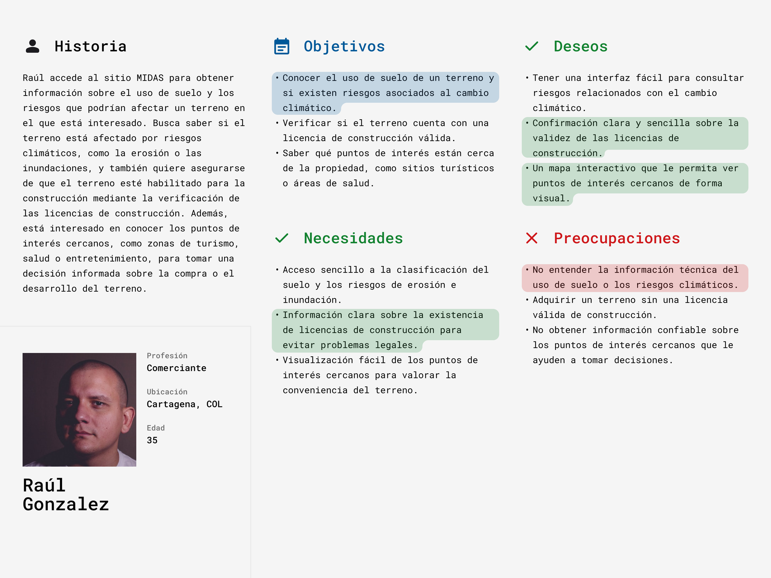
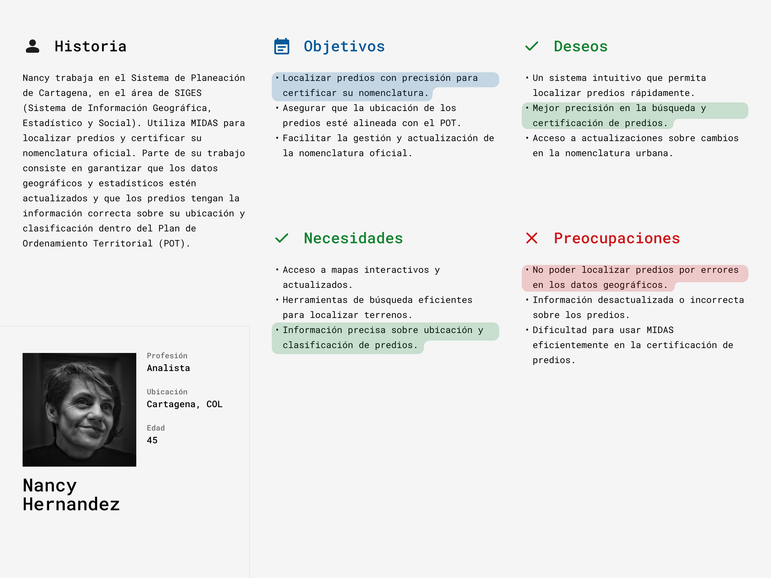
User Interviews - User personas and flows: To gain deeper insights into the user experience of the original MIDAS platform, I conducted virtual interviews with two users. During these sessions, I asked targeted questions and observed them navigating the existing website to identify pain points and areas for improvement.
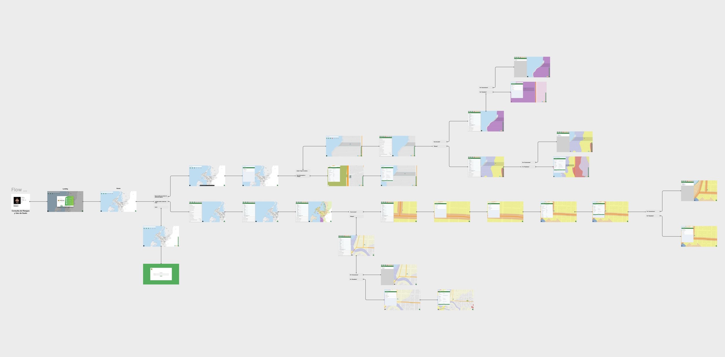
Using the information gathered, I created three detailed user personas, each representing key user groups. I also developed corresponding user flows to map their interactions and ensure the redesign aligned with their needs and expectations.


User Flow - Gustavo
INFORMATION ARCHITECTURE
WIREFRAMES
Given the limited timeframe for the project, we skipped low-fidelity wireframes and instead focused on creating mid-to-high fidelity wireframes. These designs showcased various ideas for the new platform's interface, allowing the client to visualize and choose the direction that best aligned with their vision. This approach ensured efficient decision-making while maintaining a professional and modern look for the redesign.
Designing different options, combined with regular meetings with the client, gave us a deeper understanding of the platform's functionalities. This iterative and collaborative process ensured the final design aligned with our objectives: improving the user experience and modernizing the website.
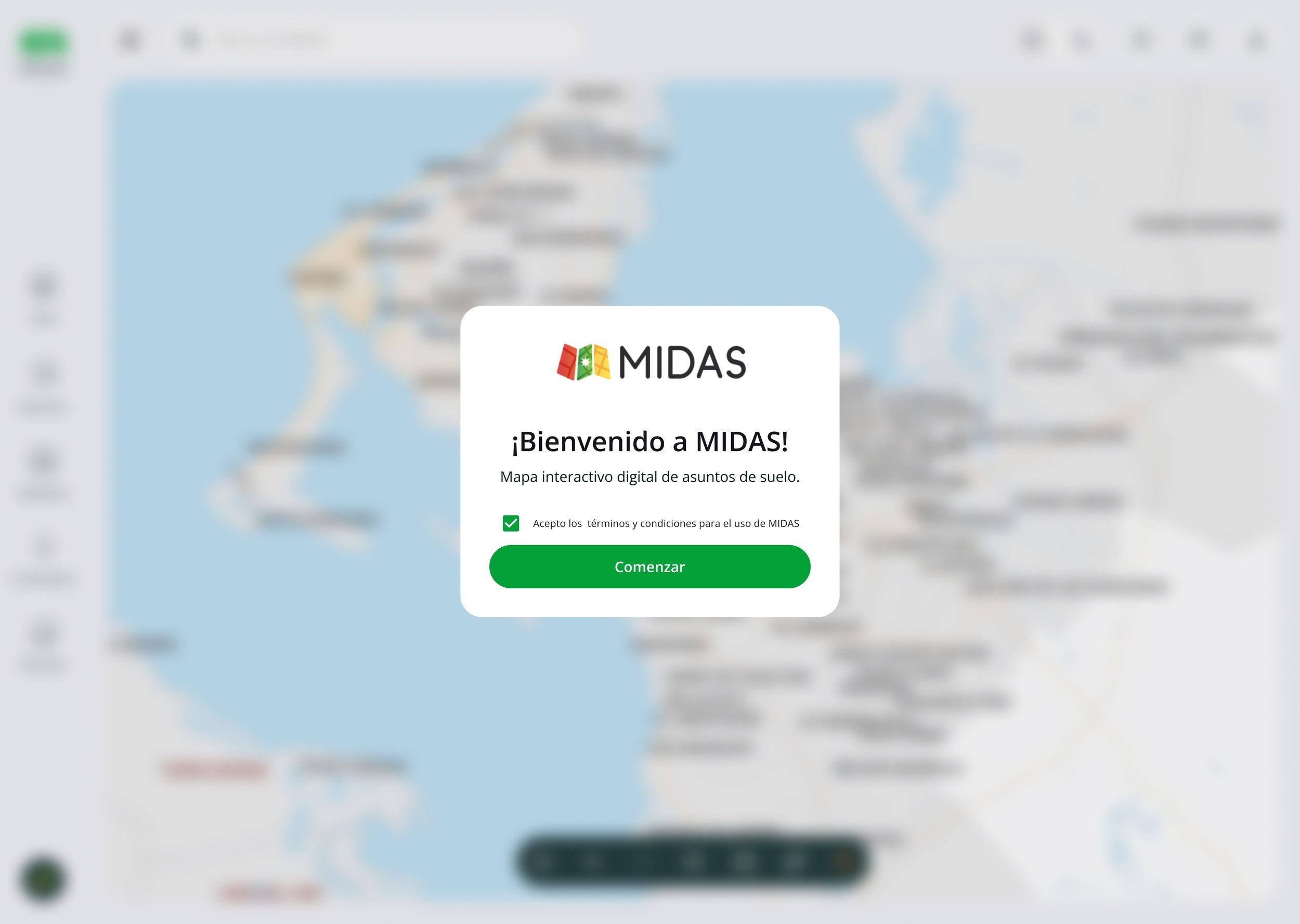
FINAL RESULTS
Capas
Resultados
Estadísticas
Others
PROTOTYPE
After finalizing the wireframes, we developed an interactive prototype to showcase key functionalities of the proposed redesign. This allowed the client to experience the platform's flow and usability in a hands-on way, providing valuable feedback that further refined the final design.
OUTCOMES & REFLECTION
The redesign of the MIDAS platform successfully addressed the client's objectives of improving the user experience and modernizing the interface. The combination of thorough research, user-centric design, and collaborative feedback resulted in a platform that better meets the needs of its users.
This project was an invaluable experience in balancing tight deadlines with quality deliverables. It reinforced the importance of user feedback, iterative design, and maintaining clear communication with stakeholders.
LINKS & RESOURCES
MIDAS Redesigned Platform - Visit the live website
Figma Prototype – Explore the interactive prototype.


